Healthcare Website Design & Development
Custom Websites for Healthcare Organizations & Businesses
We design and develop custom healthcare websites guided by your goals. We offer a number of packages and custom solutions for healthcare organizations of all sizes, as well as enterprise-level healthcare businesses from across the industry.
Trust the Experts in Healthcare Website Design
Medical Web Experts is more than a healthcare web design agency – we’re a trusted partner who will help you grow your business. We also offer ancillary services like:

Secure. Compliant. Stable. Scalable.
Healthcare is an industry that faces unique challenges when it comes to website design. A successful healthcare website:
- Communicates a business’s voice, products and services, and mission.
- Offers interactive features for messaging and data exchange.
- Appeals to both existing and prospective users.
- Is discoverable by prospective users through search engines.
- Complies with all applicable security and regulatory standards – including HIPAA, ADA, GDPR, and CCPA.
Reinventing Custom Healthcare Websites Since 2003
Since 2003, we’ve been providing custom healthcare web design and development solutions for healthcare businesses of all types and sizes – including hospitals and health systems, labs, startups, medical software/EHR companies, e-commerce organizations, medical device companies, and more.
Our experience and industry knowledge show in our work and in the success of our clients’ businesses.


Customization Through Collaboration
No two medical website design projects are exactly alike – but we’ve learned that all projects benefit from a tried-and-tested identical comprehensive process that we’ve standardized over close to two decades. Your client success manager will lead you through this process, and our marketing, design, development, and compliance leads will examine your project from all angles.
Our Process
- DiscoveryWe start by examining your business goals, target market, and project deadlines, and finish with a project plan that includes success metrics as well as guidelines for security and compliance.
- DesignCollaborative and led by our Creative Director, who’s skilled at giving form to often-amorphous design and user experience preferences.
- DevelopmentWe work in sprints, allowing you to review and comment on progress on an ongoing basis
- Deployment & hostingAfter a thorough QA process involving both sides, the site can be launched and hosted securely through our HIPAA-compliant hosting platform, the MWE Cloud.
-
GrowthDevelopment doesn’t end at
launch – it’s a continuous process that involves:
- 1. Hosting, maintenance and support for security and stability.
- 2. New functionality and website updates, which you can request online via the MWE Service Desk.
- 3. Marketing campaigns to track performance metrics and drive traffic to your new site.
See Your Website in Google Search Results
We’re experts in digital marketing for healthcare organizations and businesses. We create medical web designs with both human users and search engines in mind: in addition to creating a user experience designed to guide visitors toward becoming customers, we also build sites that keep up with Google’s current best practices for search engine optimization (SEO).
We offer a range of marketing services designed to maximize your website’s potential as a lead generation tool.
Customize Your Custom Healthcare Website Design with Add-Ons
We offer custom and pre-built solutions for needs that healthcare businesses commonly face. Any of the add-ons below can be combined with your website, and can integrate with your existing systems.
- Content management system (CMS) and blog
- “Find a Provider” search functionality
- “Find a Location” search functionality
- Patient scheduling modules
- HIPAA-compliant messaging or live chat
- Classes and events
- Testimonial carousels
- eCommerce solutions
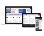
Specialization in Mobile-Friendly Healthcare Web Design
Mobile devices are driving web traffic more than ever ac ross all sectors. It’s important to make sure your healthcare website design is responsive for both mobile and desktop visitors. All our sites are 100% mobile responsive, meaning that your site will be easier to use and rank higher in mobile search results.
Security & Compliance
Healthcare is a highly-regulated industry, and your business is likely subject to a number of federal, state, and even local regulations. In addition, your website may be a route through which an attacker could access highly sensitive information like PHI, making it a potential target for hacking or ransomware attacks.
Your website is a tool to establish trust with your customers and patients by keeping their data safe, and by showing your commitment to following regulations. We’ve been developing and enforcing security practices for medical websites, portals, and apps since 2003, as well as understanding legal regulations that apply to these businesses and applying those regulations to their website.
HIPAA-Compliant Medical Website Design
HIPAA is complicated, and failure to comply can be costly. You need a partner who understands the challenges facing your organization, and who can apply practical measures to ensure a fully HIPAA compliant website.
With years of experience and our proven suite of HIPAA-compliant products and custom healthcare websites, you can be confident that you’re taking the right steps towards compliance. Regular audits by our internal compliance officer and annual third-party HIPAA audits are just some of the ways we demonstrate our commitment to compliance. These services are extended to our clients as well.
The Risks of Choosing a Local Agency for Healthcare and Medical Website Design
It’s important that your healthcare website design company understands the requirements for HIPAA compliance. Most local agencies don’t specialize in the medical industry, and are not prepared to build a site to HIPAA specifications.
We’re experts in HIPAA, and we sign BA agreements with each of our clients. Your services include checks and audits with our on-staff Compliance Officer.
What Else Can We Do For You?
We offer a comprehensive range of products and services in conjunction with healthcare web design. You’ll find all your needs taken care of under one roof
- Mobile-friendly responsive design
- Custom mobile app development
- Custom health portal and web app development
- HIPAA-compliant web and email hosting
- Healthcare internet marketing
- Medical content writing
- Search engine optimization (SEO)
- Custom video production
- Logo design and branding
- Custom video and photo galleries
- Advanced data tracking with Google Analytics and Mouseflow
- 100% HIPAA compliance