Mobile usage continues to grow daily, and so is the scope of what people are exactly using their smartphones to do. People have become more comfortable buying, managing their banking, as well as getting information about their health care via their mobile devices than they were years ago. In fact, over half of all smartphone owners (62%) have used their smartphone to get information about a health condition in the past year. Having your healthcare practice mobile-friendly is a definite requirement, but is a mobile specific site or a responsive site the best option for you?
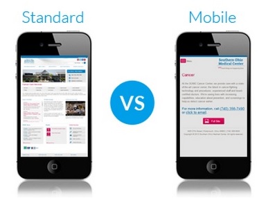
What is a Mobile-Specific Website?
Your practice would essentially have two websites, one designed for desktop viewing and uses your main website URL (ex. “MedicalWebsite.com”), and another that is a “m.” version of your website URL (ex. “m.MedicalWebsite.com”) and is optimized for viewing on a mobile device.
Pros:
- You can select what information you prefer a patient to see based on their viewing preferences
- Easier option than completely overhauling current site- current desktop coding does not have to be changed
Cons:
- Increased time and money spent since you will be updating content in two separate places
- Different look and feel than the desktop site, more simplified look might not satisfy patient needs
What is a Responsive Site?
If you go the responsive route, you won’t have two separate websites for mobile and desktop. You’ll have one site only, and this site is programmed to automatically change its layout in order to better fit the user’s screen.
Pros:
- You get an all-in-one site instead of two separate sites- this means lower costs and less time to manage the site
- Great user experience for patients no matter what device they are using
- If you’re building a site from scratch it can be easier to start by making the site fully responsive than building a separate mobile-specific website
Cons:
- Can be more expensive to implement than a mobile specific website
- Larger file sizes can cause slower viewing experiences
[related_content]
The Right Choice for Your Practice
Realistically, patients will not care whether your mobile medical web design is mobile-specific or responsive – it just needs to be user-friendly on mobile and make the most sense for your practice. If you cannot offer a potential patient an easy online experience via their mobile device, they are likely to find a competing health care provider who can.