Medical website design experts focus on building websites that are both intuitive for patients to use and easy on the eyes. Though having a great medical website with excellent content and an aesthetically pleasing design is one of the best things you can do for your business, unattractive websites can sometimes be successful. Medical website designers can learn a lot from the few ugly gems that have hit it big with users.
1. Craigslist. Arguably the most influential classified advertising website in the world, craigslist.com has built a reputation as an excellent online resource as much as it has for scandal and strife. The design of the site is startlingly simple – a white background filled with row after row and column after column of plain, lowercase text. No images, no flash, and no scrolling banners or large headers. The simplicity of the site is one of the things that make it so successful and easy-to-use. It’s accessible and the columns and rows exist to organize the material on the site. By focusing on function first, the site’s designers have made it so intuitive that people can’t help but appreciate it.
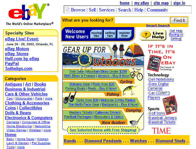 2. eBay. eBay.com is one of the most link-cluttered websites on the internet. In addition to the homepage loaded with links, images, headings and buttons, the bright primary color scheme filling every page should make it hard on the eyes. However, the organization of the site makes it someone easy for users to find a category they’re looking for as well as search the site. The colors make it memorable – and the design makes it easy to shop.
3. IMDB.com. The Internet Movie Database – after having branded itself as “IMDB” – has built a huge following among movie and TV buffs as well as people interested simply in finding quick information on an actor or film. The cheesy movie-reel theme has recently given way to a cleaner and smaller banner, but the long pages (requiring users to scroll through dozens of paragraphs of content under different headings) are still there. Though it’s a lot of content organized into small sections on one page, it’s somewhat sensible – and regular users know exactly which section to go to in order to find what they’re looking for. There’s something comforting and familiar about being able to see the same data for any given film.
Tell us what
you're working on.
Most good projects start with a conversation. If you have materials — requirements, diagrams, vendor documents, notes — send them over. We'll review them before we talk.