Expert Digital Healthcare Marketing Services
Get the Most Client Leads with Our Expert Marketing
Our Healthcare Marketing Services
Selecting the right company for your healthcare marketing is important; Medical Web Experts offers a broad range of medical marketing services such as: SEO, Video Marketing, Social Media Marketing, Pay Per Click, Branding, E-mail Marketing and much more.
We are a healthcare marketing company who are very aware of the the constantly changing nature of online marketing. We also know how difficult it is to maintain an active and effective presence online. Facebook, Twitter, email newsletters, SEO, Pay-Per-Click, YouTube, reputation management – we know this is a lot to manage, and we’re here to help. We understand the legal barriers to marketing medical products and services. We have on-staff legal counsel and are experienced with delivering success in a highly regulated environment, and we are skilled in managing rules and regulations surrounding HIPAA compliance.
When it comes to your company’s image, statistically speaking, many large clinics and hospitals are usually not aware of the amount of review pages about their doctors that exist.
With MWE, your organization won’t have to worry about that. We take proactive measures to make sure the information available is accurate and reflects what you want it to say.
Our Healthcare Marketing Services Include:
Seo
Boost your rankings in Google, Bing and Yahoo for keywords that matter to your healthcare business.
Video Marketing
Create engaging videos and use them to market your healthcare business across the web.
Social Media Marketing
Establish your presence and build a following on sites like Facebook, Twitter, Google+ and Pinterest.
Pay-Per-Click
Increase your web traffic. Target users actively looking for your services and boost leads.
Email Marketing
Dramatically increase patient/customer retention – they’ll love getting email from you.
Branding
Enhance your brand with a powerful, professionally-designed logo and marketing materials.
Content Marketing
Professional, SEO- and conversion-optimized content for your website, blog or marketing materials.
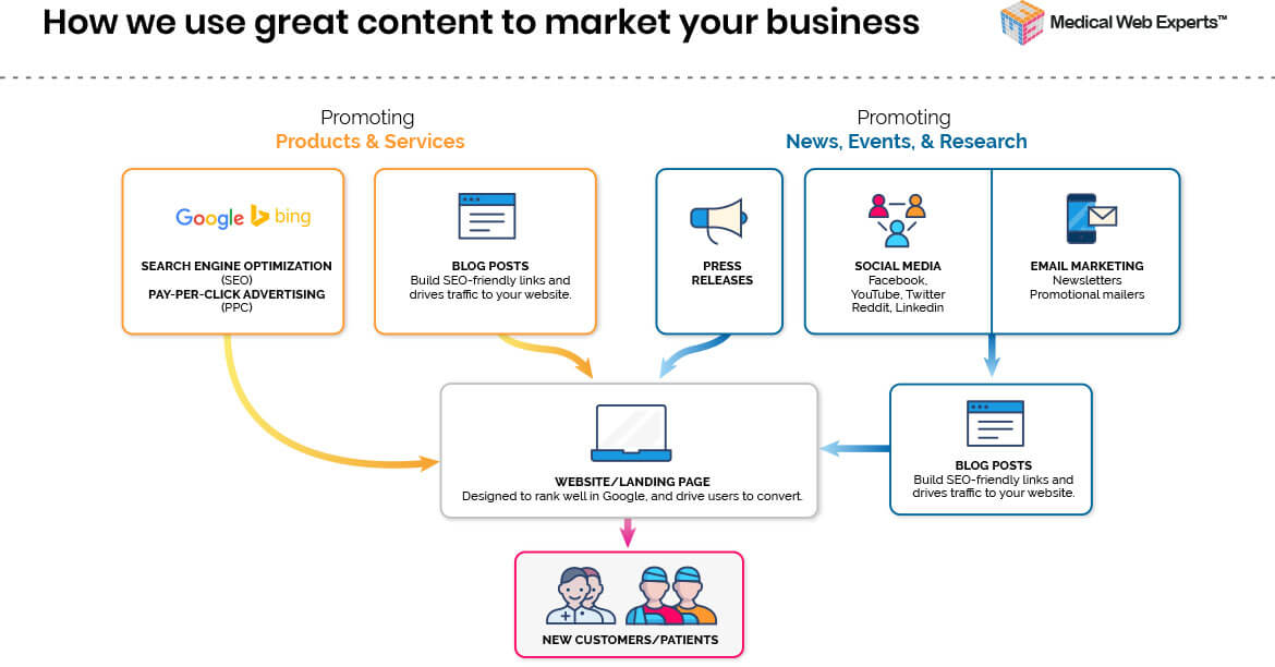
Supplementing Your Marketing Campaign With Great Content
High-quality content feeds into a successful marketing campaign. When incorporated into your marketing strategy, web content in the form of blog posts, landing pages, patient education resources, and off-page content like press releases can help drive quality traffic to your site.